Hardware Interaction
Embedded Interface and Interaction
Summary
Forewords
Arriving at Withings, the first two products I had the chance to work on were the Smart Body Analyzer and the Pulse, the brand's first activity tracker. Both were being developed in parallel. They needed to share the same identity, as they were designed to be complementary and work with the same companion app.
Both products had their dedicated Embedded Software team, Product Manager, and shared the Mobile Dev team and me as a designer. Projects started for me on December 2012, to end around March 2013 for the Smart Body Analyzer and June for the Pulse.
The scope
When I started working on the project, most of the technical spec had been defined; screens had been selected, as well as hardware interaction elements.
The Smart Body Analyzer was built on the knowledge acquired from Withings first scale, the Body Scale; the original product had neat tricks like identifying the user based on its weight.
The interface was a simple succession of 3 screens (Weight, Fat Mass and Body Mass Index). The Smart Body Analyzer would add Heart Rate monitoring, Temperature and Air Quality monitoring (CO2 level), increasing the number of screens and the complexity of the information displayed.
The Pulse would be monitoring the user’s activity by counting Steps, Running, Elevation, analyzing Sleep and measuring Heart Rate.
I'll be focusing here on two aspects of my work on these products, the UI of both devices and the hardware interaction on the Pulse.
Two screens, one identity
We wanted the same kind of interface but the nature of the devices screens was very different.
The Smart Body Analyzer's screen
The scale has a 2,4 x 1,6 inches (6 x 4 cm) LCD screen, and a 128 x 64 pixels definition. It is meant to be read from a 5 to 7 feet distance (1,5 to 2 m). It has no grey levels (only black and white), so no possibility for Anti Aliasing. It is a custom screen that had special characteristics:
- Pixels are not squares, they are rectangles (0,8 x 1 ratio)
- The screen has a very strong afterglow
The reason for the odd pixel ratio is to make a better use of space (bigger screen) while maintaining a screen with a limited number of pixels and a heigh and width that remain multiples of 8, easier to manage in the embedded software.
The Pulse's screen
The Pulse's screen is a 1 x 0,3 inches (2,5 x 0,8 cm) mono color OLED screen with a 128 x 32 squared pixels definition, high frame rate and almost no afterglow. It is meant to be read from 20 inches (50 cm) distance. Again, no grey levels, so no Anti Aliasing.
Designing for the Smart Body Analyzer
Learning from the Body Scale
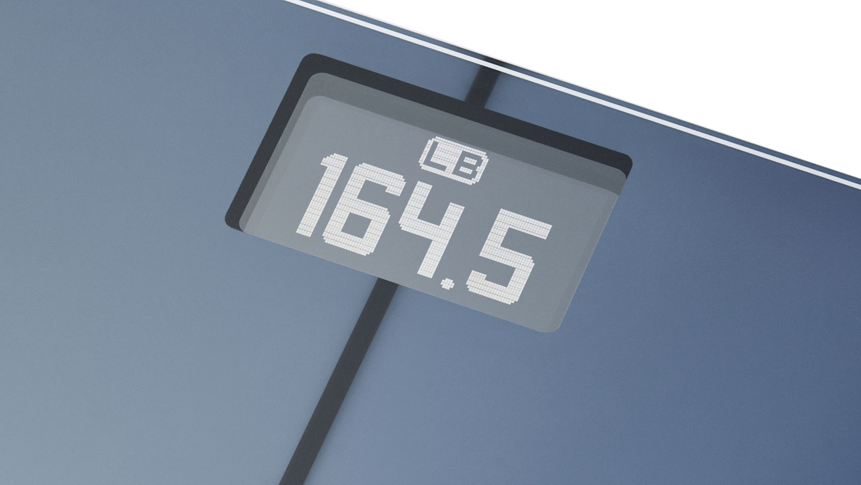
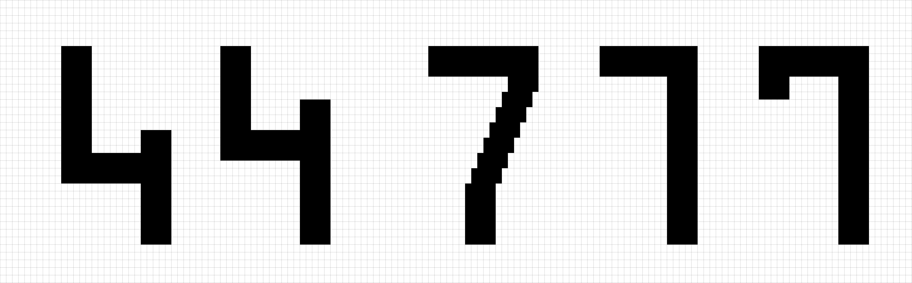
The Smart Body Analyzer(SBM), used the exact same screen as the existing Body Scale. As you can see on the visual, the font type on the screen features some large, rounded font.
Three problems were identifiable: first, the rounded font type made the pixels very visible: in the second place, the pixels being rectangular and not square, what should be quarter circle appeared oval:
The last problem is not visible on a snapshot. When the user steps on the scale, the scale take a few seconds to converge to the right weight measurement. During that time, numbers on the screen are changing. The screen suffers a high afterglow, making the successive numbers on the screen difficult to read:

Solving visual problems
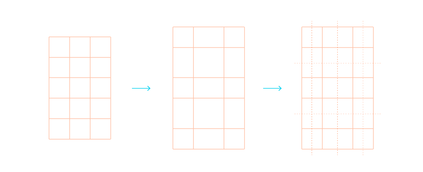
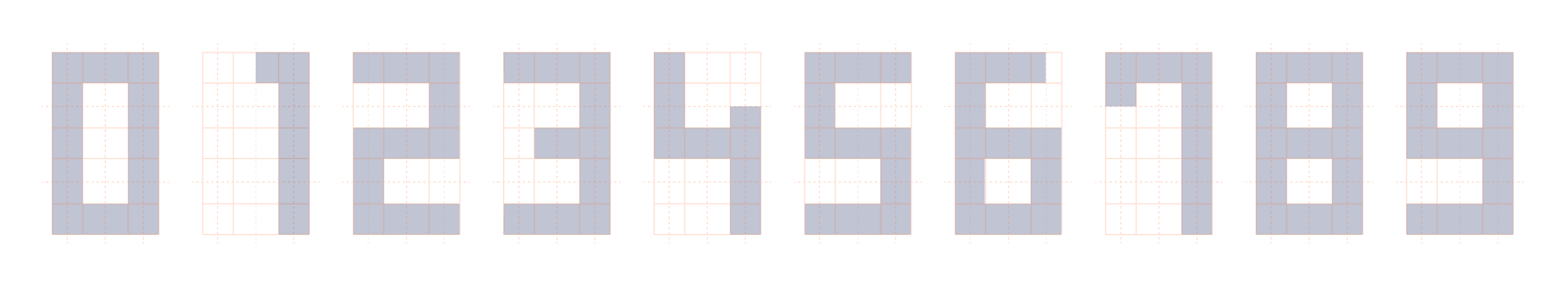
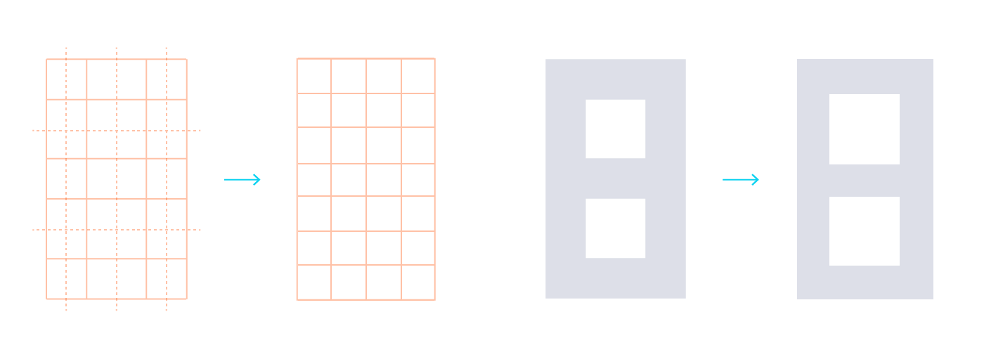
Most of those problems could be overcomed with visual solutions. Using the pixel ratio (0,8 x 1), we can recreate a perfect visual square using the following grid (0,8 x 5 = 4, 1 x 4 = 4):
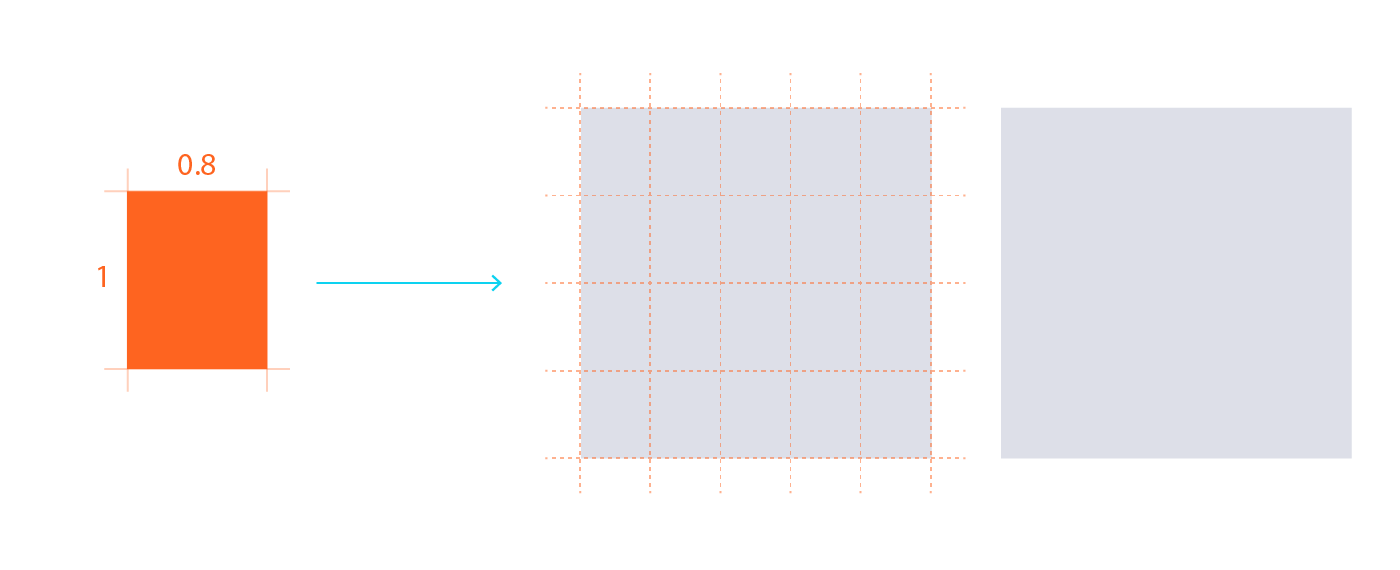
Then, building a matrix on that square, we can draw a 3 by 5 digital display, enough to display any number.
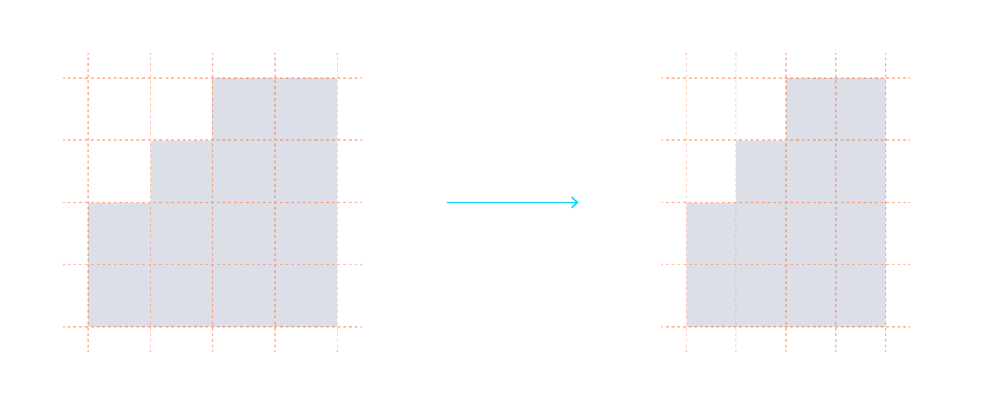
In a pure squared matrix, the digits would be 20 px high and 15 px large. Given the reading distance, I wanted to maximize the size of the digits for better legibility. Introducing wider spaces inside the matrix and playing with half squares units improved the grid both in legibility and style:
In order to minimize the afterglow's effect on legibility, we could maximize the overlapping zones between numbers by sticking to the matrix, thus reducing the pixel changes between two digits:

The result are the following digits. They would be used to display the main information on the screen.
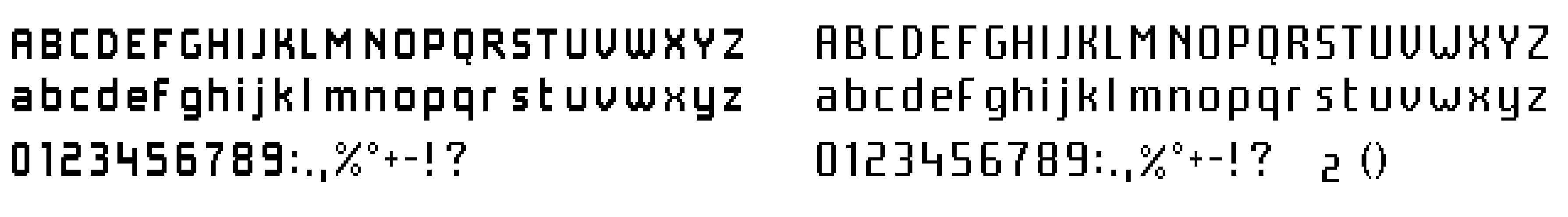
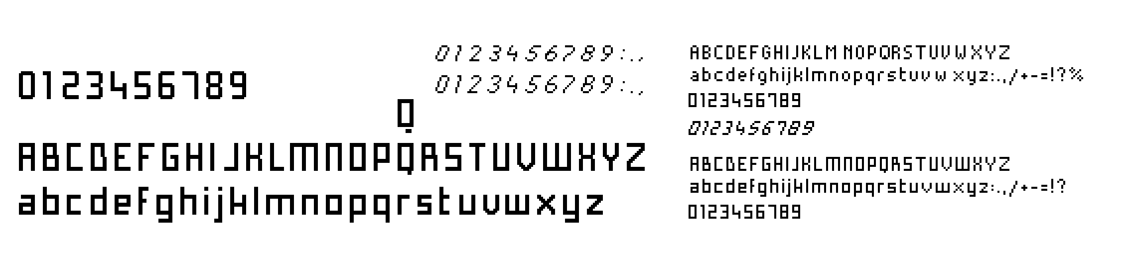
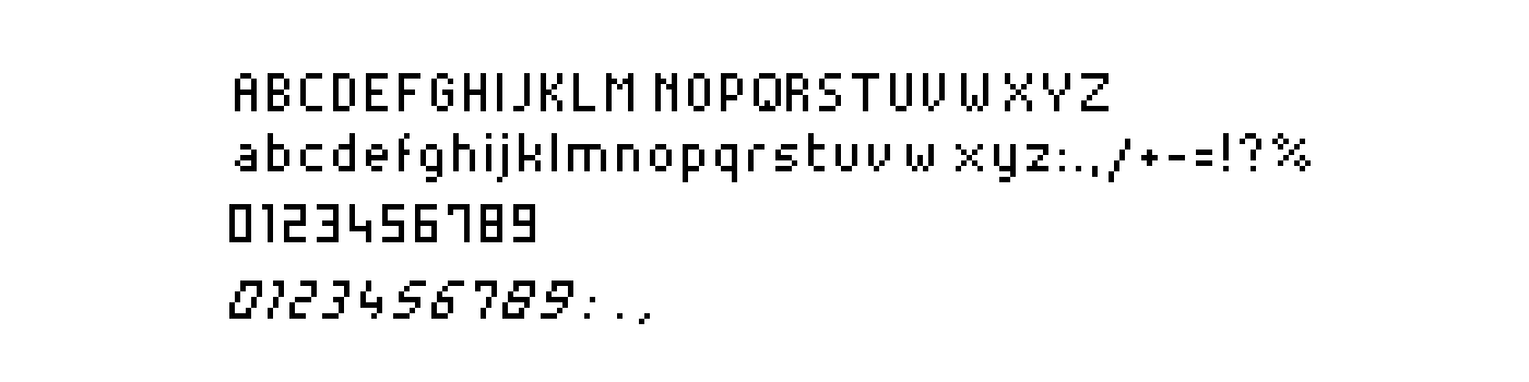
We also needed a smaller font for texts and secondary informations. This one would be alpha numerical. As it was smaller, it was not possible to create a perfect square. After a few tests, I decided to give the verticals a stronger weight than the horizontal, to give more inner space to the font and make it look thinner:
Using the screen's characteristics
Here is a video of the final UI of the scale. Both big size digits and small font type are used. The screen having a strong afterglow and high latency, transition between screens happens in Fade in / Fade out. Any movement transition is completely unreadable:
Sorry about the feet, I did not have time for a pedicure!
These high latency and afterglow characteristics can sometimes be beneficial, for instance during the Heart Rate measurement (0'30" on the video). The spinner does not use any grey level (the screen does not allow that), but the afterglow creates a similar effect.
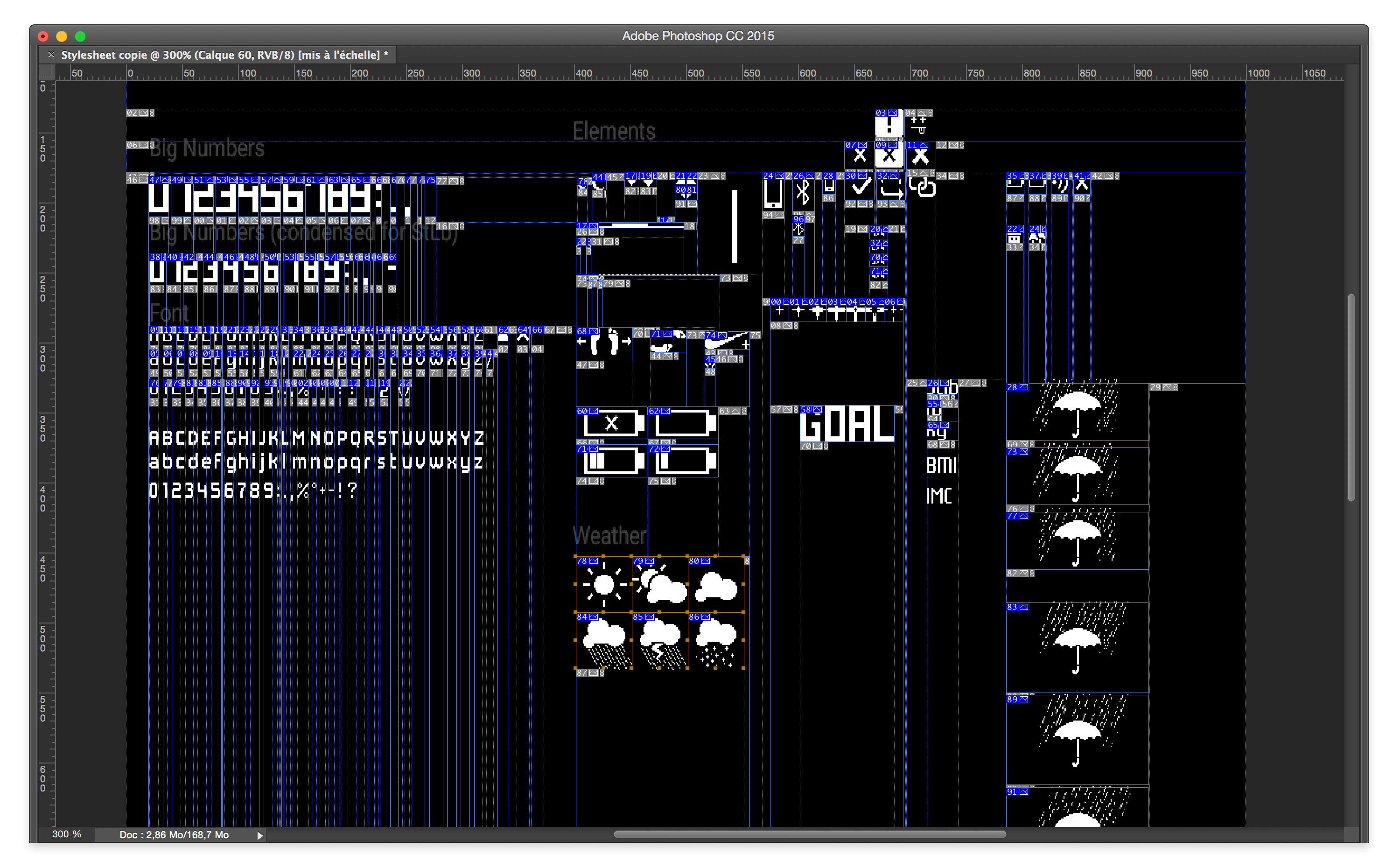
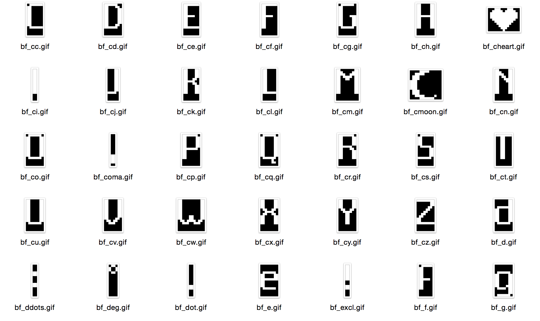
Delivering assets
Items were then named and delivered to the Embedded Software Team as GIF files, then translated into bytes arrays they could use:
Designing for the Pulse
As the specs show, the Pulse's screen is very different from the scale's screen. Mostly, it is better; pixels are squared and frame rate is higher. But the screen was integrated inside a rubber touch black plastic box that would make it totally invisible when OFF, but would also blur the display when ON.
Testing on the real product
The challenge was to make a font that would be readable with these constraints while maintaining an identity similar to the Smart Body Analyzer. When on the scale, printed screens at scale were enough to test legibility. On the Pulse I needed to see the result directly on the device's screen.
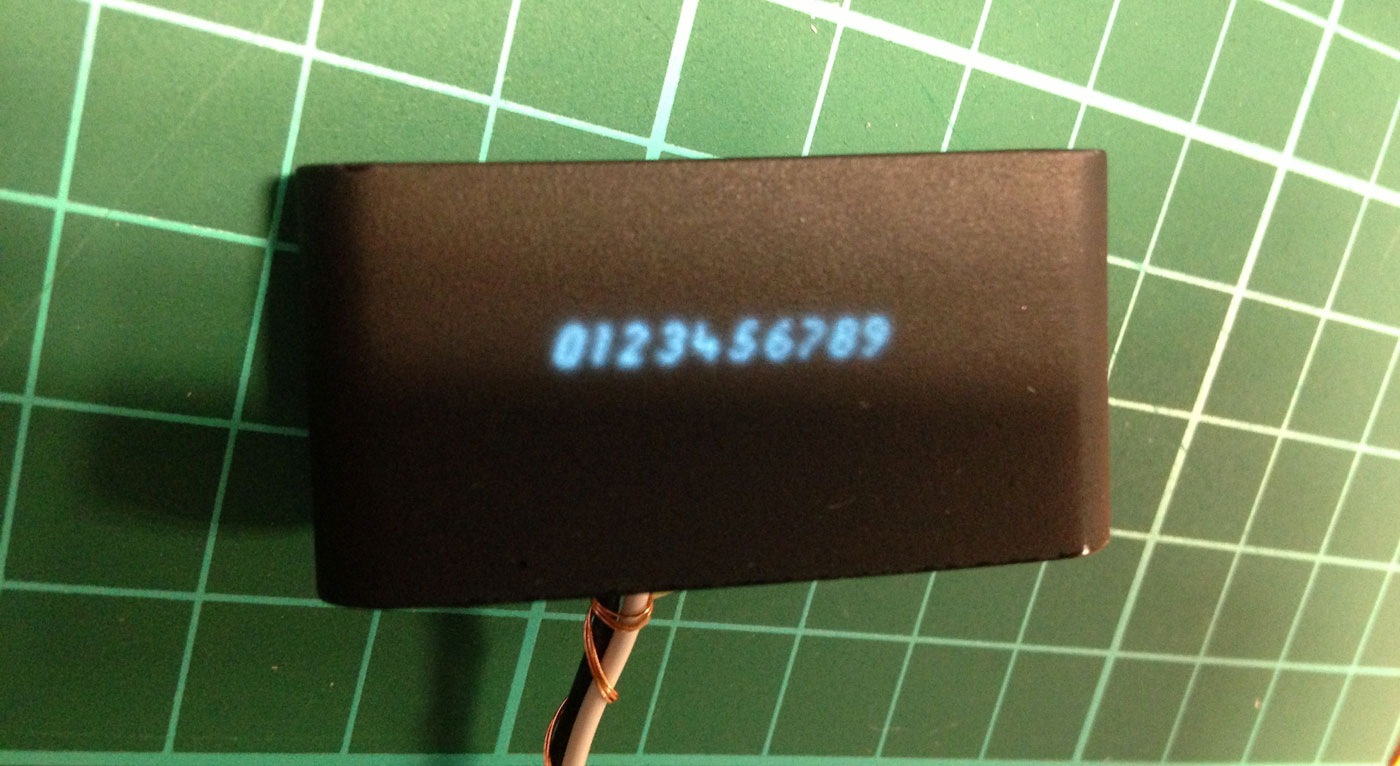
A small setup through a Serial port and some Processing code allowed me to create an efficient workflow to transfer visuals to the device:
On the picture, the Pulse is a prototype. On the final product, the blur effect was largely reduced. Yet, it still had the same characteristics: it was a legibility constraint as well as a natural Anti Aliasing that was interesting to use.
From the Smart Body Analyzer to the Pulse
In order to balance the blur effect, I needed to add more negative space in the font than I had on the scale:
Like on the scale, a secondary font would be used for texts and secondary informations.
The final result is very close to the Smart Body Analyzer's font:
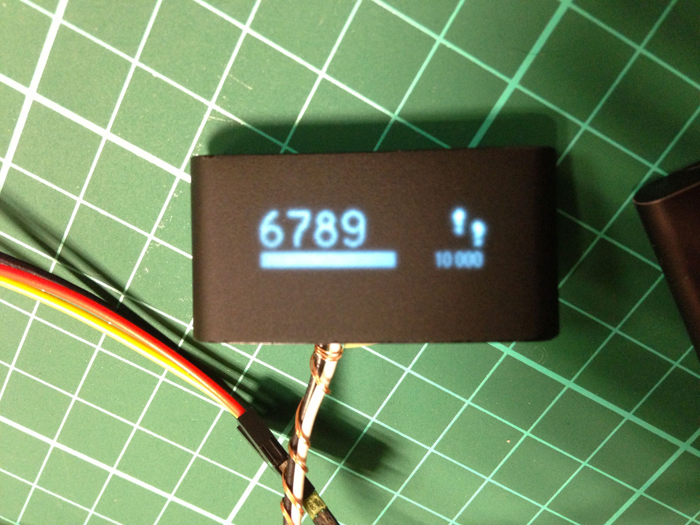
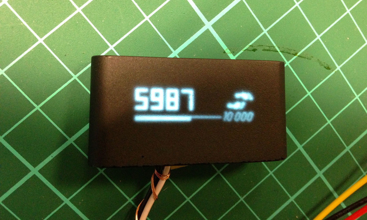
The reading distance being very short on the Pulse, we could have an even smaller font giving secondary informations on the screen:
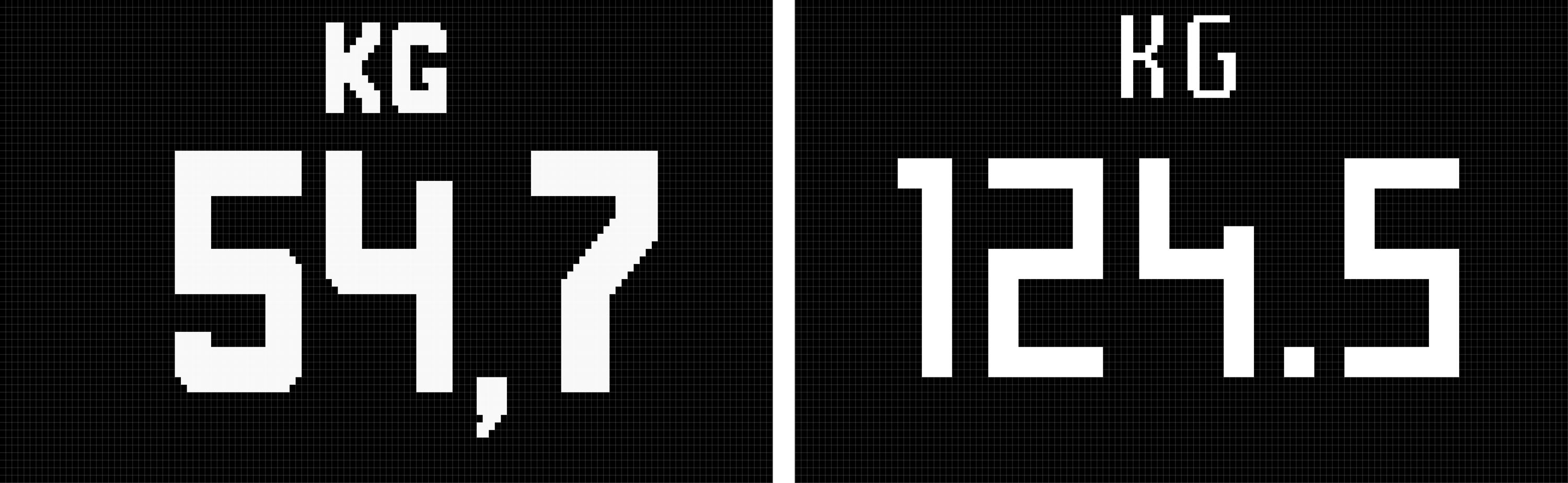
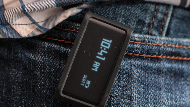
On this snapshot of the final product, you can see all three types; 10:47 is written with the main digit font, AM is using the main alpha numerical font, SCOTT is written with the smaller font:
Hardware Interaction
In order to keep the story short, I will only talk here about the Pulse and only about some aspects of the design methodology.
The elements of interaction
The Pulse's components that can possibly be used for Human Interaction are:
- A screen
- A hardware button
- A TSI 4 zones touch sensitive surface
- An accelerometer
From that list, we can deduce a number of possible interactions:
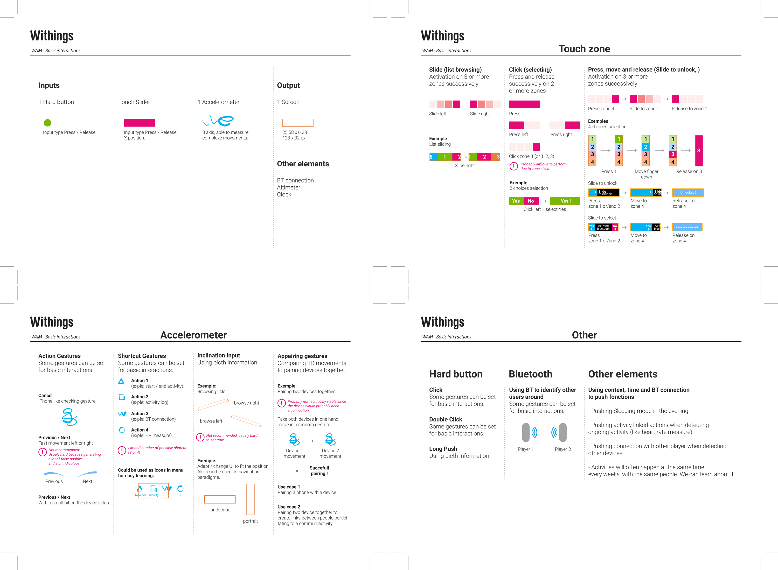
Most gestures interactions were put aside because of their complexity to implement and to master by the user. I mapped the content users needed access to, the actions that could be performed and the context in which the product would be used.
Prototyping hardware
At that point, we had no working prototypes, so I was working on mockups that would simulate the hardware:
The touch sensitive zone was supposed to be under the screen, and was seen as the most important interaction element, allowing to Swipe left and right and Click on several zones of the screen, press and drag elements from left to right (Slide to activate).
The working hypothesis was then to Press the hardware button to light the screen ON and use the touch zone as the main interaction element.
When the device's prototypes arrived; a few things became clear:
- The touch zone would always suffer latency in order to reduce false positives
- The touch zone being under the screen, it was very difficult for users to find it and use it
- It was even harder to use while walking
- The hardware button was easy to use, even while moving
Given those observations, I turned the architecture around, used the hardware button as the main interaction element (one Press, light on, second Press, switch to second screen, etc…) and the touch zone as the element of interaction for secondary interactions (browsing the history of a given metric, start a program).
The problem of the touch zone location remained, and visual solutions kept failing in user tests. The solution finally came from a hardware update (a few weeks before production), replacing the opaque TSI by a transparent one and placing it on top of the screen, making it a touch sensitive screen.
Delivering the User Interface specifications
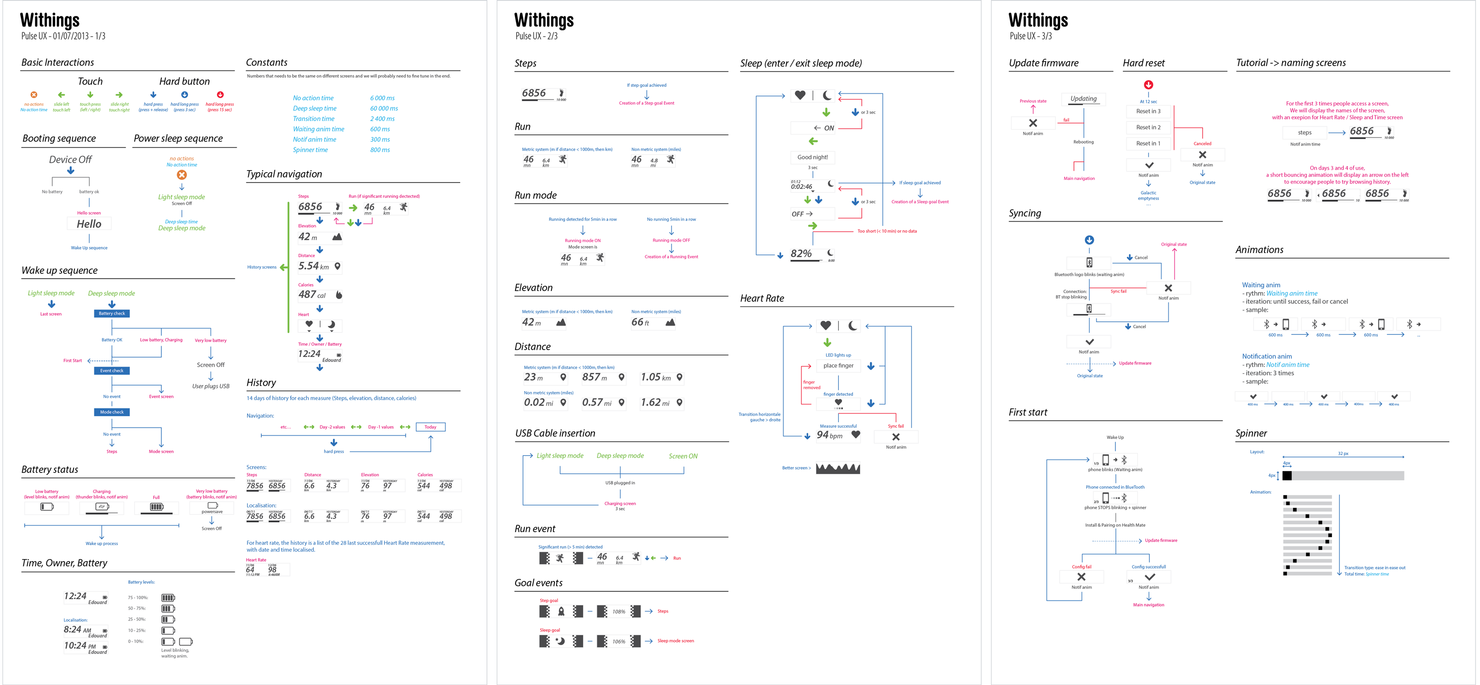
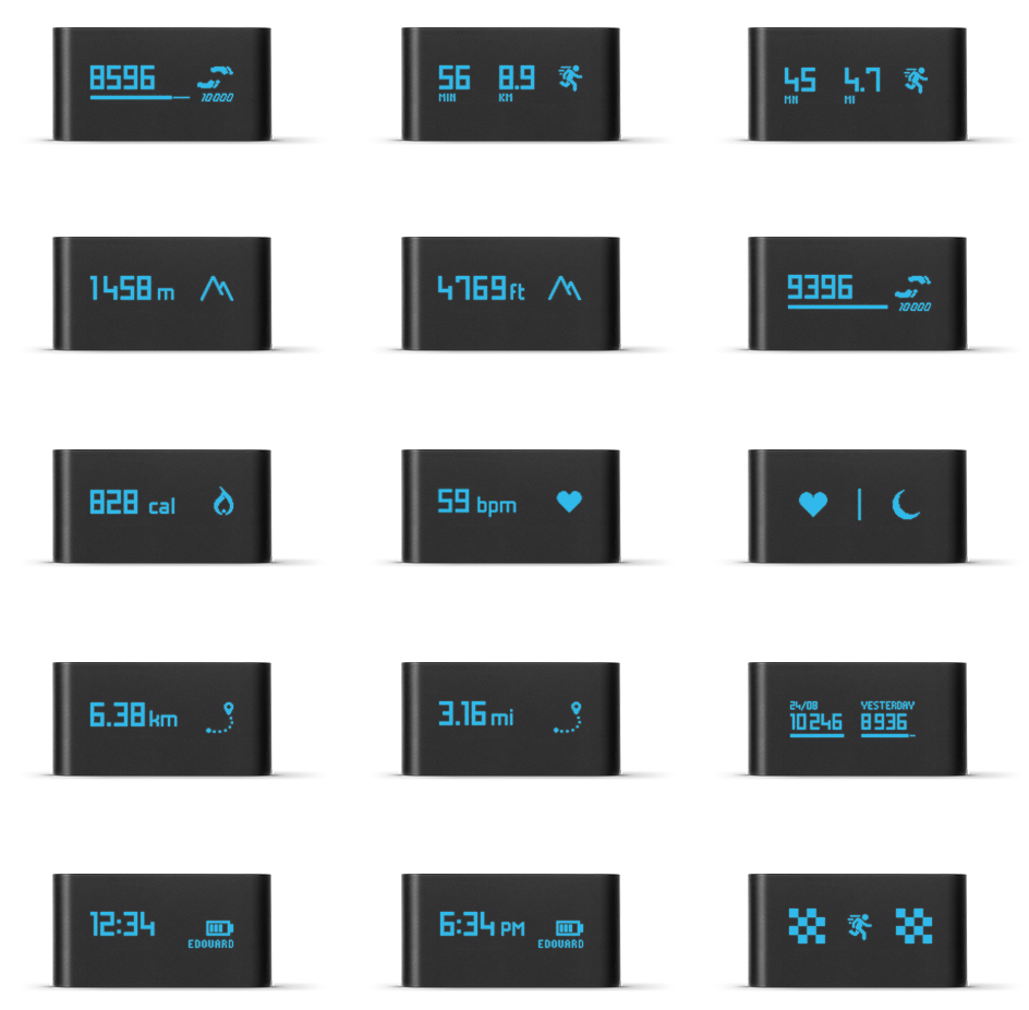
A look at the final UI
Here is a look at the final product and software, and a selection of screens.
Final words
These projects were an opportunity to learn working under the heavy constraints of hardware interaction. It was amazing to see the differences between the mockups and the prototypes, and how little changes dramatically improved the quality of the feeling on an interaction.
It was also a challenge to get the most out of the devices components and use their characteristics at best. On the Smart Body Analyzer, people ended up thinking that the new scale had a much better screen than the older one, even though they were exactly the same.
Working on the companion app at the same time as the embedded UI is another story that also brought its share of challenges.
Thank you for reading!